Research into the existing market and an analysis of the desired audience for each, this will help broaden my understanding of where the notebooks I produce will sit on the market, or what they offer that is different to what already exists.
Young Designers Kit - Notebook - Design Museum
-
Stumbled across this while on Aisle one, looking at different note books
and grid systems outside of just typography. The design museum shop has some more interesting note books and although they have no
educational value the design alone appeals to designers and has a
defined audience.
-
The audience is clearly communicate with the title, though defining an audience for my type sketchbooks may choose to be slightly more of a challenge. This will be the main area I will work on over the weekend.
____________________________________________________________________________________
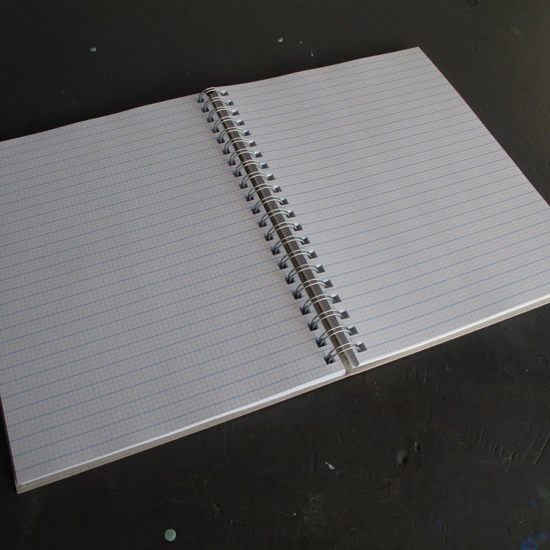
Doane Paper - Grids and Lines
-
Another pretty basic grid book, I don't think it particularly offers anything new to the market but again it shows that designers still want note books. I think the importance of pen and paper is become increasingly influential
as computers take over young designers need to understand that ideas are not generated by sitting in front of a screen. This could be a possible angle to take for my sketchbooks!
____________________________________________________________________________________
Moleskin series on Architecture
These notebooks are more along the same lines of what I aim to achiece and the audience I want to market too. With an over saturated market for plain notebooks I need to make sure that my designs challenge the conventions of what a notebook it and educate the interfacer.
I will do another separate post just for moleskin notebooks given their prominence in the market. I will analyse how they have target specific audiences and why they have been so successful.
"The focus is on style and craftsmanship in the creative process, that primordial step of sketches and freehand drawings.
Each volume, edited by Francesca Serrazanetti and Matteo Schubert,
presents a different perspective of the design world. Sketches,
scribbles, watercolors and personal notes from each designer are
include"


 The brief for the workshop was -