Starting with an analysis from a students perspective I have broken down the papers online presence. These points are the main issues that I feel the online presence of the newspaper has in relation to students.
I feel that again its the visual impact the site has that would put students and possibly other readers off. As the brief is about a promotional campaign this would be an extra to the brief, but I feel it would be extremely appropriate, even just applying the previous colour schemes to the website.
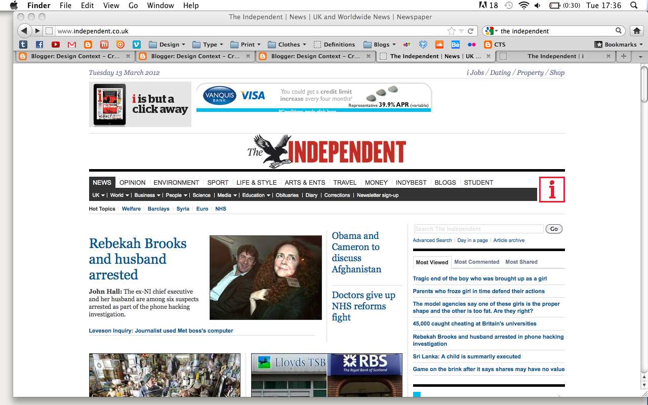
- formal content, appropriate to current audience
- Reasonably hard to locate the i paper if you don't know what the logo represents
- Something clearer may send students in the right direction

- No differentiation between the paper (same as the printed format)
- No visual differentiation between the different subject matters, making it much harder to navigate the site, which is something that would put students off
- Maybe creating a new site separate from the independent website would be more appropriate (somewhere students can engage away from the papers current audience.
No comments:
Post a Comment