I want the type for each era of music in the vinyl pack to be visually relevant to the time. I have done some reading into the developments within typography in the last 50 years, much of which was based around the music at the time so will work well for this project. Although I am only researching 50 years now I may continue this research for my own benefit though my CTS blog.
Research taken from Typography -
'An encyclopedic survey of type design and techniques throughout history'
By Friedrich Friedl, Nicholaus Ott & Bernard Stein
1945 -
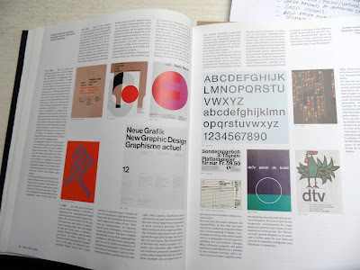
- Swiss style, main contributors were Switzerland & USA
- Used lines of capitals, old expressive forms gave way for clear arrangement of illustration and text.
- Pioneers - Zurich & Basel
- Style with no regional charachteristics but international quality
- 'Elementare Typographie'
- Abstract design / photography & concept through out
- Typographic style was a major force in post war years
- Switzerland used prodominently sans serif type
- USA - Combination of serif & sans serif
1955 -
- Pictorial typography
- Post second world war
- New forms of typographic expression
- Started in USA
- Introduction of film setting / copying / transfer technology
- Integrated text / picture concepts emerged
- Text was altered, extended two and three dimensionally, cut and made into collage
- Rules ignored - Abtruse arrangement of text
1960 -
- Stability - Sans Serif typefaces
- Akindez / Grotesk / Franklin Gothic
- Helvetica / Folio / Univers
- Large amounts of unprinted space
- Grid systems
- Bold faces headlines
- Technical precision
1965 -
- Psychedelic design and type
- Soon deteriorated into a fashionable accessory
- Typefaces distorted - Hallicinatory in a fashion
- Origins of style - Drugs and altered perceptions they produce
- Linked to pop and rock music
- Main contributors - LA / New York / Chicago / London
- Questioned tired practical approach
- Artists input to type
1975 -
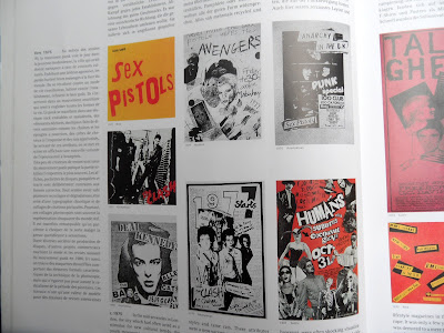
- Punk era
- Photocopied type
- Main contributor London
- Reject effective communicative design
- Soon became swallowed up into overall design of the 80's
1980 -
- Adam Frutiger - Frutiger typeface
1985
- Encyclopedic typography
- Wealth of expression and inventiveness
- Unencumbered by fixed formulas
1990 -
- Multi-stylistic typography
- Introduction of the computer
- Stages of design speedily accepted or disregarded
- Copies reproduced without loss of time
- Software & programs rapidly improved
- Playful method of design underwent positive development
- Pictorial and ornamental typography
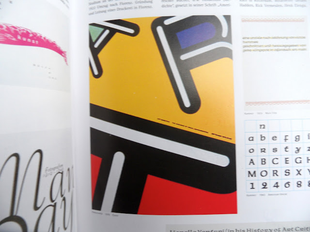
Some more examples of interesting typography that I found thorough the book, could be interesting to incorporate some of these for my logo development.


No comments:
Post a Comment