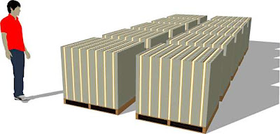
I was thinking about doing an infographic for the article on large numbers and came across this. Amazing to see money in this context and still hear politicians talk about billions of pounds so casually.The first image represents a million dollars in $100 notes, second $100 million, third a billion and the last a trillion dollars. Was initially going to use a really simple design just to show the difference between the numbers, need to break it down and simplify it to be to show the difference. (disgusting as the images are they were the best representation I could find)


No comments:
Post a Comment